One screen for the whole fitness day.
Calories, macros, meals, workouts, AI confidence, and weekly reports on one premium surface. Designed for scanning, not hunting through tabs.
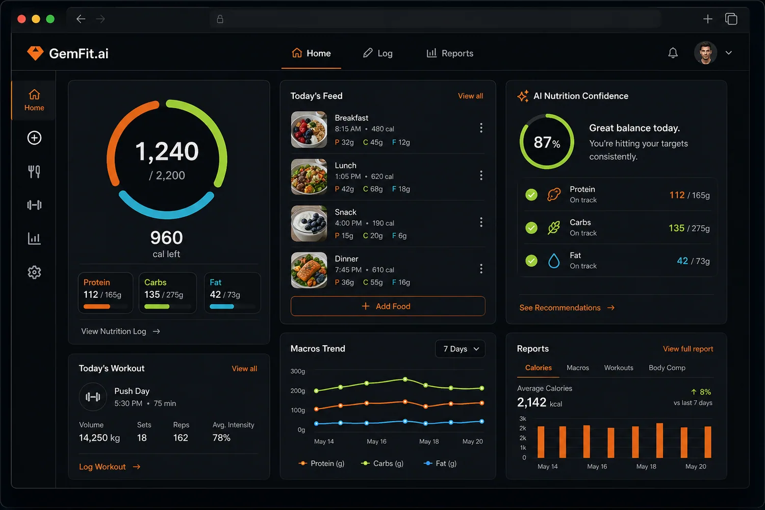
For users who want one home screen that shows the entire fitness day at a glance.
- Calorie ring
- Macro rings
- AI confidence card
- Meals feed
- Weekly report
Most fitness apps have a home screen. A few have a real dashboard. The difference is whether you can answer 'what is the state of my day' in three seconds without scrolling.
GemFit's dashboard is built around that three-second question. Calories, macros, meals, today's workout, the macro trend, AI confidence, and a live weekly report all sit on one premium surface.
What a real fitness dashboard should show
A dashboard is a hierarchy. The most important data is the largest, the most colorful, and the most central. Secondary data is nearby. Tertiary data is one click away.
GemFit's hierarchy puts the calorie ring at the center, macros directly beneath, today's meals to the right, today's workout below the rings, and the weekly report on the right column. The AI nutrition confidence card sits in the top-right.
- Calorie ring as the visual anchor
- Macro bars directly underneath, color-coded
- Today's meals, workout, and AI confidence beside the ring
- Weekly macro trend and reports kept on the home surface
Hierarchy first, charts second
Charts are useful and easy to over-do. A dashboard full of charts is not a dashboard, it is a chart wall.
GemFit limits the home surface to one trend chart (macros across seven days), one report block (calories, macros, workouts, body comp), and one AI read (the daily confidence card). Everything else lives on dedicated pages where it can have proper space.
AI confidence on the home surface
The AI confidence card is the dashboard feature that most directly affects weight loss adherence. It tells you, in one number, whether the macro data feeding your deficit is mostly verified or mostly estimated.
If the day is a series of barcoded packaged meals, the score is high. If it is photo guesses for every entry, the score is lower and the card surfaces a one-tap option to refine the heaviest estimate. The grade for the day uses that score, so the deficit math is honest.
Mobile parity
Most dashboard apps fail on mobile because the layout is built for laptops first. The phone version becomes a vertical pile of cards in random order.
GemFit's mobile dashboard reorders for thumb reach and gym use. Calories and macros stay on top. Logging is a single tap. The weekly report is one swipe away. Charts are pinch-to-zoom.
Common questions about fitness dashboard.
Yes. Cards can be reordered and hidden. Power users can rearrange for personal preference.
Yes. Mobile parity is a hard requirement for the home surface. The mobile layout reorders for thumb reach without dropping data.
Yes. Tablet uses the desktop layout with denser typography and larger tap targets.
Logging updates the rings, the bars, the AI grade, and the weekly trend in real time. There is no manual refresh step.
Yes. Each day has a permalink dashboard. The weekly report aggregates seven of those into one recap.
Related guides.
Open the dashboard, log a day,
see the rest.
Build the day from one premium app surface. Meals, macros, workouts, accountability, and progress reports that stay connected.